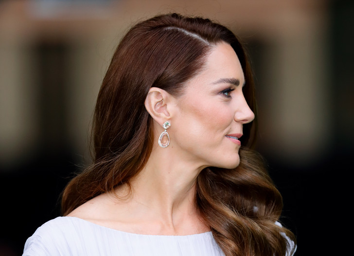
We study the color of the iris, monitor its changes against the background of different clothes, and reveal the main beauty secrets of the Duchess of Cambridge.
Do you know which shades can light up your eyes, and which are more likely to make them dull and inexpressive? Kate Middleton clearly knows.
The Duchess of Cambridge got an appearance with a very interesting set of pigment, and the regulation of its manifestation is a real fashionable direction. The scripts that her stylists create for Kate are most often impeccably verified. True, sometimes life interferes in the process of their implementation… For example, stylists decide to highlight the shades of the Duchess’s appearance with an interesting blouse, but between her and Kate’s eyes there is a black medical mask, and even the lighting fails … The iris instantly acquires an indistinct shade, the eyes fade and lose their expressiveness. This is how the script of Kate Middleton’s recent fashion appearance in a “cucumber” blouse was disrupted.
If we had only these photos, then the conclusion from the shade of the eyes would be unequivocal: there is nothing interesting in them. Meanwhile, the blouse chosen by the stylists was designed to prove just the opposite. Kate has a complex shade of the iris, for which coloristic support is very important. What is he really?
Since we have far from the only photo of the Duchess of Cambridge, it is quite possible to get to the bottom of the truth. After rewinding the secular chronicle for literally a week, we see a completely different Kate …
The blue and green hues of the blouse were supposed to light up Kate’s eyes, but the black mask and poor lighting made them indistinct…
On November 18, at the Royal Variety Festival, the Duchess looked so bright and spectacular that it seems as if there is another woman in front of us. At least, the color of the eyes was replaced exactly: from indistinct gray they turned into green. How did that come about? In fact, there is no magic here. And camera flashes have nothing to do with it. It’s all about the dress. More precisely, in the very coloristic support that it gives to the iris of the eyes.
Kate Middleton is the owner of gray-green eyes. In fact, we are dealing with a variety of shades of khaki, which are delicately and multifaceted intertwined in the iris. From what color is located nearby, it depends on which facet will come to the fore. If we leave shades of green without support, we get a pronounced gray pigment. In this case, the eyes will not look bright. As soon as a suitable color appears next to the face, the corresponding pigment immediately appears.
To maintain eye color, it must be surrounded by related or additional shades – those that are opposite in the color wheel.
This process is subject to certain laws. To accentuate the eyes, you need to place a quoting shade (related) in the portrait area (clothes, makeup, accessories). It is desirable that it be darker or lighter. Have you ever noticed how Kate goes with all the shades of khaki? They make her eyes stand out. If the color is darker, then they appear lighter. This happened according to the scenario with the emerald dress. If the shade is lighter, then against its background the eyes look more saturated and deep.
If we want to make the eyes brighter, we need to use the so-called “complementary” color. This is a shade that in a 12-part color wheel is located exactly opposite. Here it is important to take into account all the characteristics: quote the color at a similar temperature and choose the appropriate “softness/brightness” parameters. Kate is doing a pretty good job with that. At the disposal of the Duchess is a whole set of “complements”, so in the iris of her eyes, there are many replicas of green. Beige-olive notes are highlighted by blue (the eyes seem warmer), and gray-green notes are purple-burgundy.
Since we are talking about complementary colors, it is impossible not to note how subtly “complements” echo in the images of Kate. Green is akin to the shade of her eyes, and for hair with a brown undertone, it is complementary. Blue and blue-green options also highlight both eyes and hair. Now, do you understand what the stylists’ idea was when they dressed Kate in a blouse with blue-green Turkish cucumbers?
Now, do you understand why there is so much green and blue in Kate’s wardrobe? It is these colors that allow her to minimally use makeup while remaining fresh and bright. If we see accent arrows on the eyes of the Duchess of Cambridge, this indicates one thing – there is a need to tighten the colors of the exterior to the brightness of the chosen outfit. Of course, for a public person, such options are simply necessary, because the reasons often require output in things slightly brighter than all shades of khaki. Though… It seems that in her gray-green and soft blue-purple Kate Middleton still looks much more refined than in the royal blue.
Don’t miss interesting posts on Famousbio
